OZONE DEMO APP
Nudging Toward Sustainable Mobility in Singapore
PRODUCT DESIGN, INTERACTION DESIGN, PROTOTYPING


ABOUT THE PROJECT
Designing a Digital Mobility Solution for Singapore Commuter
In early 2024, I collaborated with Nippon Koei (NK), a Japanese engineering consultancy, after their Singapore team won a Land Transport Authority (LTA) competition to tackle urban sustainability challenges in the CBD and Jurong Lake District (JLD).
Their winning idea, OZONE, is a digital journey planner designed to support Singapore’s “car-lite” vision by promoting walking, cycling, and public transportation over private car use. Since NK brought technical expertise, my role was to help translate that into a user-centered digital experience that could engage and influence everyday behavior.
What I did
Completed the project in a 4-week sprint, balancing speed with strategic clarity
Collaborated closely with cross-functional stakeholders
Conducted product benchmarking and desk research to support design decisions in absence of user testing
Created a high-fidelity design and prototype, with embedded digital nudges into key touch points
Overview
What is the design vision for OZONE?
We aim to design a lightweight, intuitive journey planner that could subtly encourage behavior change through nudging mechanism, making walking, cycling, and public transport feel like the easier choice in daily life.
To move quickly, we focused on rapid iteration and prototyping over branding or complex visuals, ensuring the design could be easily understood and tested.
In collaboration with NK’s data and infrastructure team, we shaped strategic UX features based on behavioral insights, delivering a journey planner that uses embedded nudges to encourage smarter, more sustainable commuting choices.


DESK RESEARCH
From Insights to Design Direction
Given time constraints and limited access to user testing, I needed a way to shape OZONE’s experience around proven commuter behaviors. To move quickly without compromising user value, we conducted a desk research focused on a competitive analysis of journey planner apps and behavioral design principles.
What I analyzed
To define a relevant design strategy for OZONE, I started from the research question and find answers by analyzing how the best practice of popular journey planner apps like Google Maps, Waze, Apple Maps, and CityMapper would applied. Beyond technical capabilities, I mainly looked at how each platform uses subtle behavioral nudges to influence commuter choices.
From what I found of the best practices, I was able to shaped a clear design intention


[↑] Research Approach
How we came up with design intention
3-STAGE NUDGE FRAMEWORK
Strategizing behavioral cues across the user journey
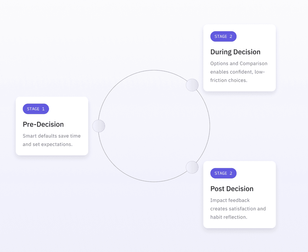
To encourage car-lite behavior, I adopted a behavioral design approach based on the proven nudge theory. I structured them to align with key decision points in the user journey; (1) before, (2) during, and (3) after the trip.


Nudges to Habit: a Behavior Loop
While each nudge targets a specific stage in the commuter journey, together they continuously re-appearing in user's journey, shaping and reinforces user behavior over time.
Over time, this loop builds habits, aligns with the user’s commuting goals, and subtly moves behavior toward sustainability — without requiring drastic change or sacrificing usability.
DESIGN
Translating Framework into Design
With the 3-stage nudge strategy in place, we translated each behavioral cue into tangible design decisions. The following sections show how each stage was implemented through the interface.


Stage 1; Pre-Decision
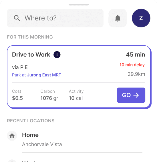
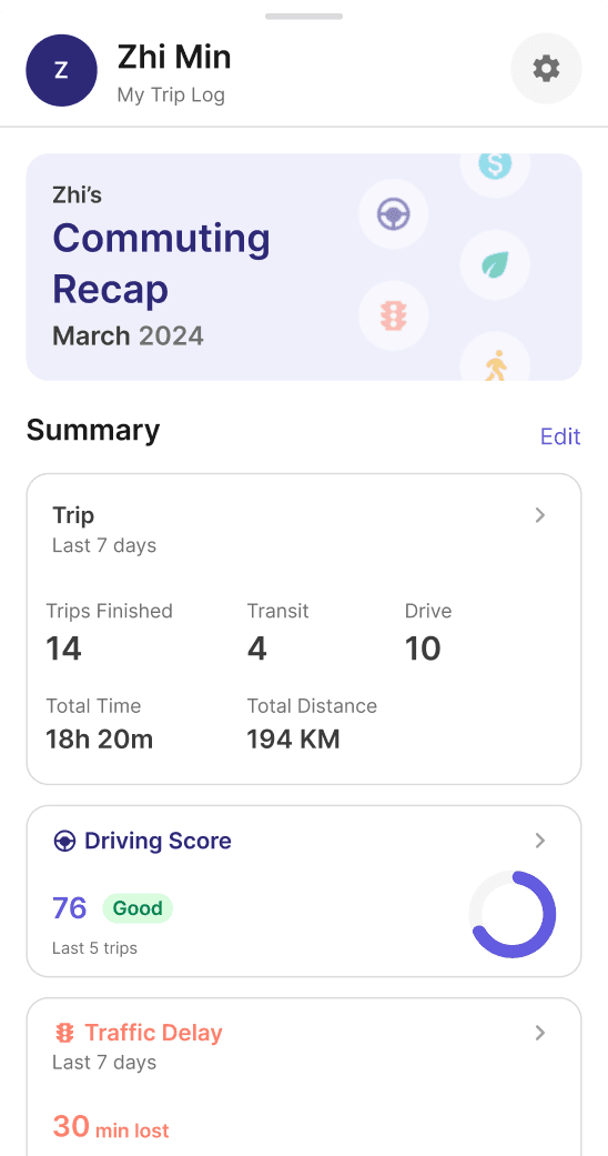
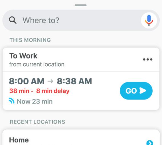
Stage 1 (Pre-Decision) helps users make better choices before they even start deciding or even before opening the app. It focuses on smart defaults and proactive nudges, delivered through widgets, push notifications, or a ready-to-go homepage. By anticipating intent, the system surfaces the most relevant route at the right moment, minimizing effort and hesitation.
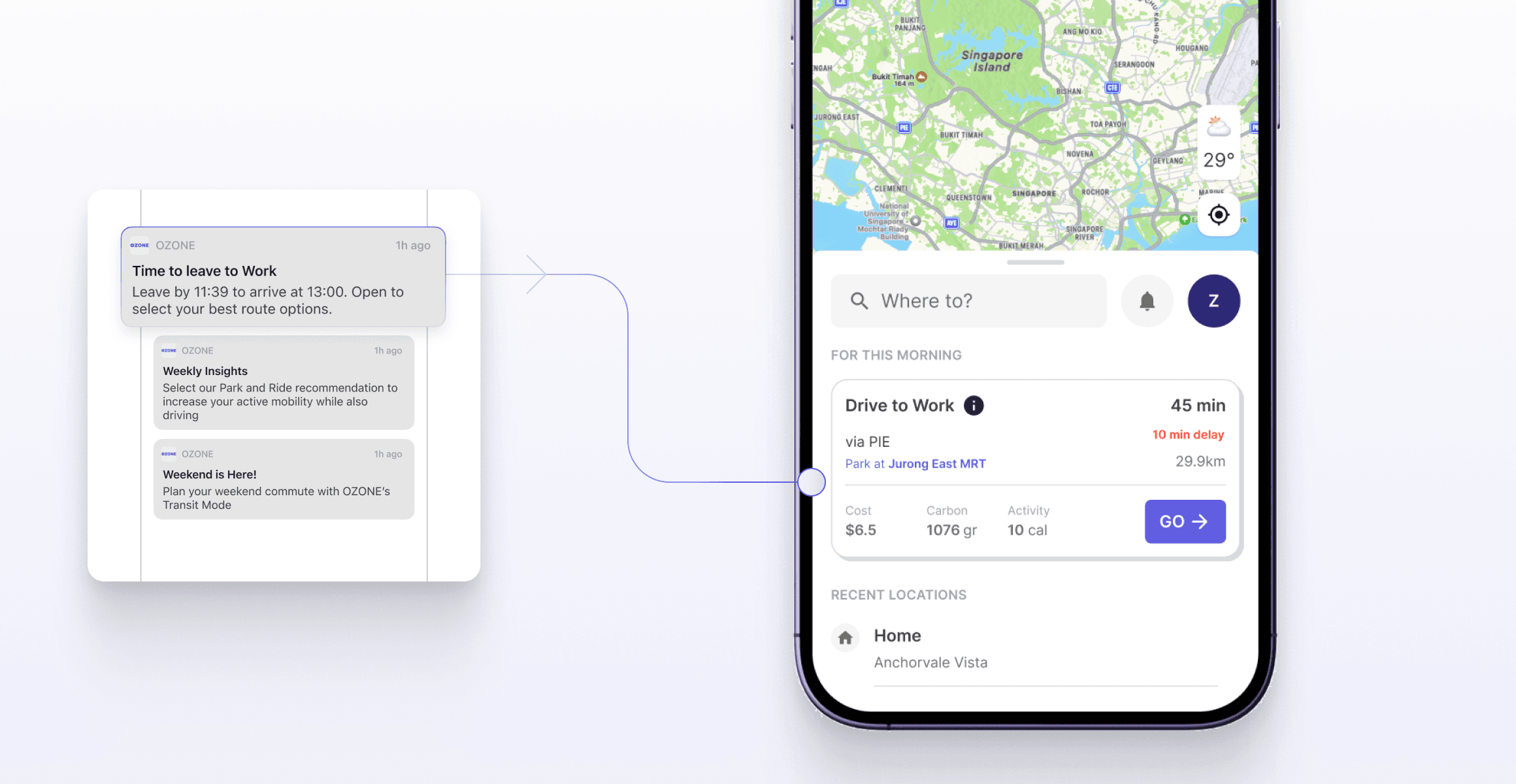

[↑] OZONE's homepage
How the nudge is implemented at the start of user's journey
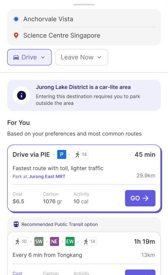
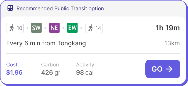
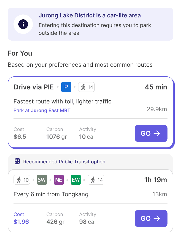
Stage 2; During Decision
Stepping up to stage 2 is where users can actively decide between options. Initially, we explored two approaches — Direction 1, focused on proactive suggestions and Direction 2, which emphasized comparative insights.
But the clients wants both and realized both approaches could complement each other. By creating a well structured and clear information architecture, we combined the benefits of both into a single screen.
Users get timely suggestions and can compare options in one flow, creating a smoother, more confident decision-making experience that builds trust and supports diverse commuting goals.

[↑] Search results & recommendations
2 initial directions of nudging merged into 1 screen

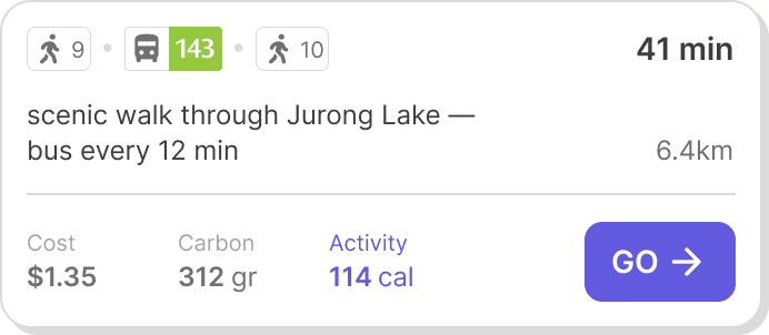
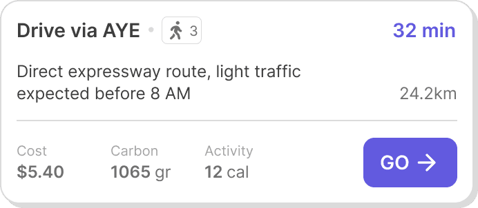
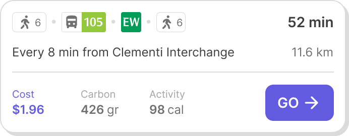
In Stage 2, the journey shifts from suggestion to decision. Once users enter their origin and destination, the interface surfaces the most relevant routes in a clear, structured layout.
Layered UI shows route options at a glance, with details only when needed.


[↑] OZONE stage 2's page structure
How I organize multiple layers of informations
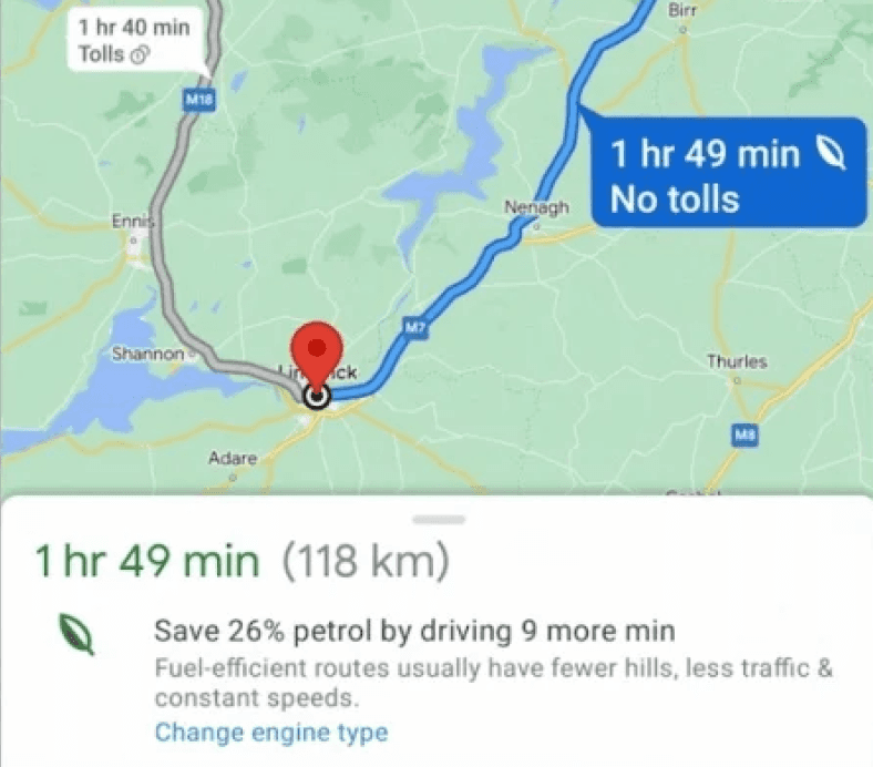
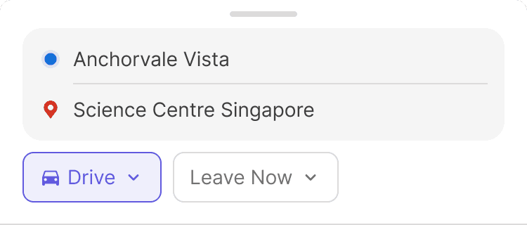
The design supports quick mode switching between Drive and Transit, enabling exploration of possibilities without friction
From Orchard to Jurong Lake District, discover routes that help you get around Singapore in a way that works for you
[↑] Drive and Transit Mode
OZONE gives real-time data for users to decide between the modes
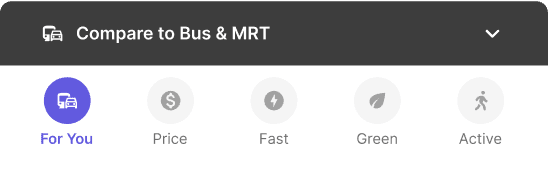
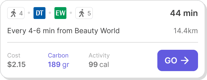
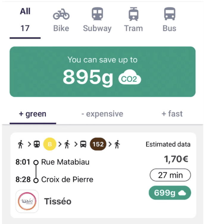
The bottom navigation surfaces different results complete with quantified route options, empowering commuters to make informed, efficient choices aligned with their commuting preferences
Optimized for Decision Making
Quickly filter routes by OZONE’s recommendations or your preferences – cost, time, carbon, or activity
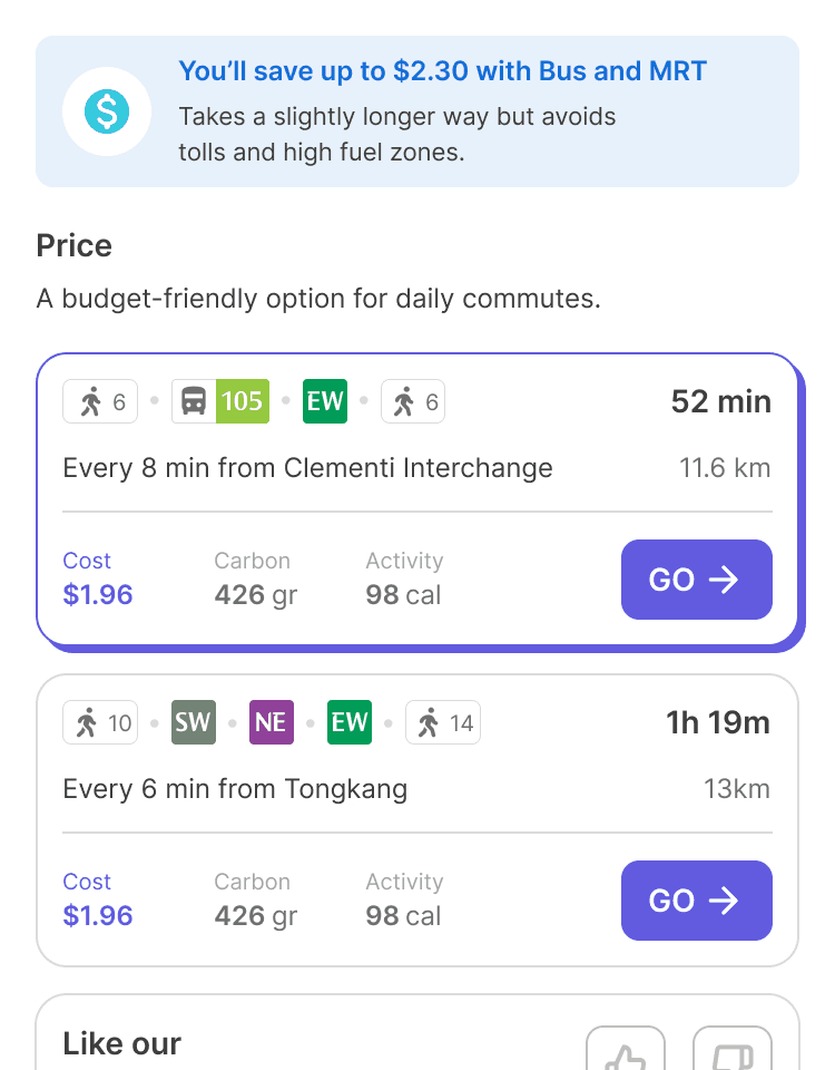
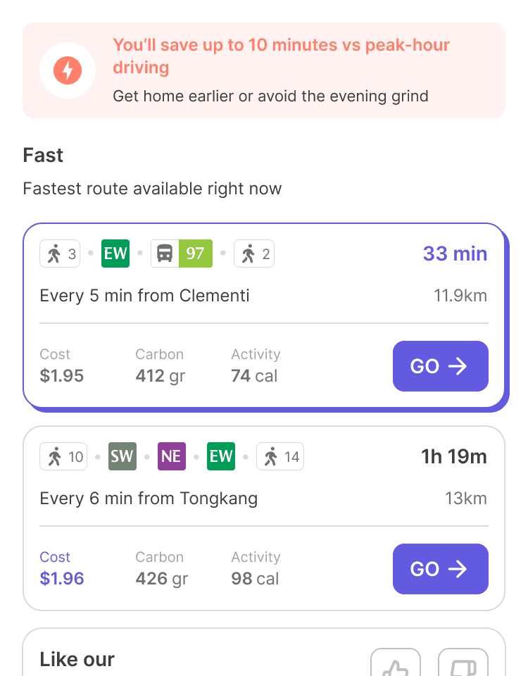
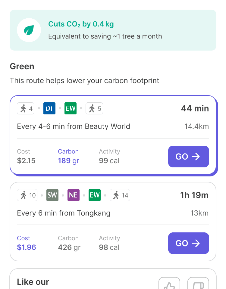
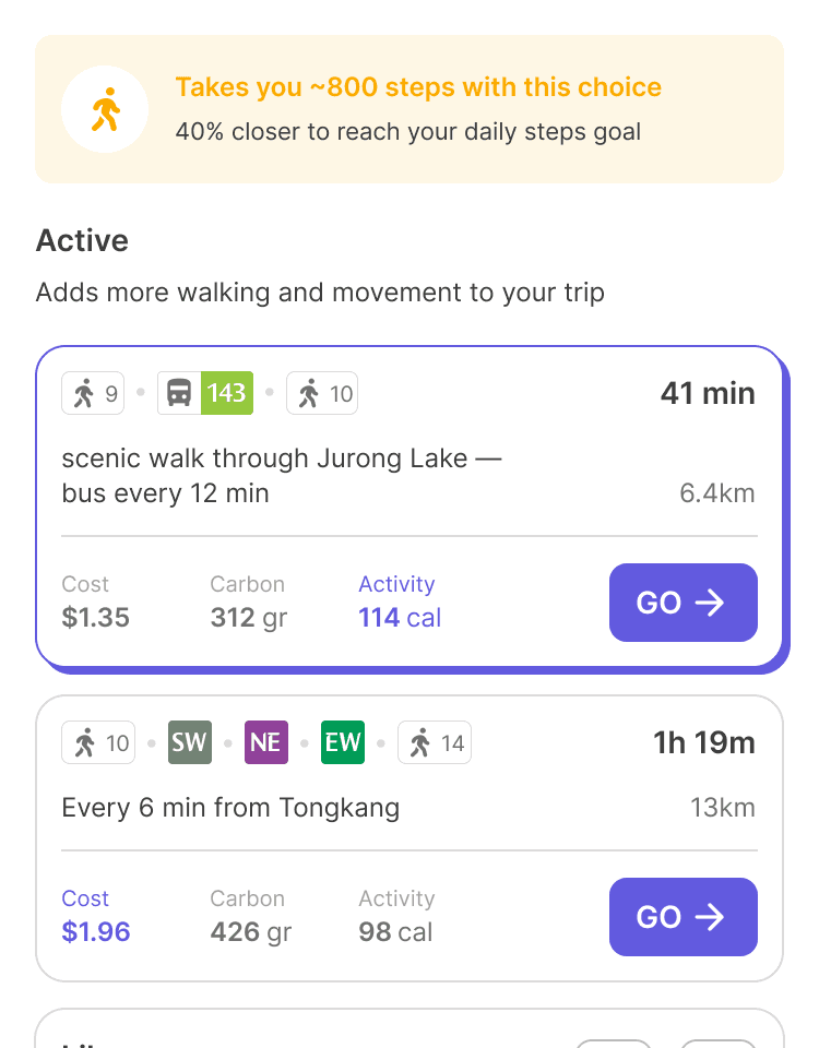
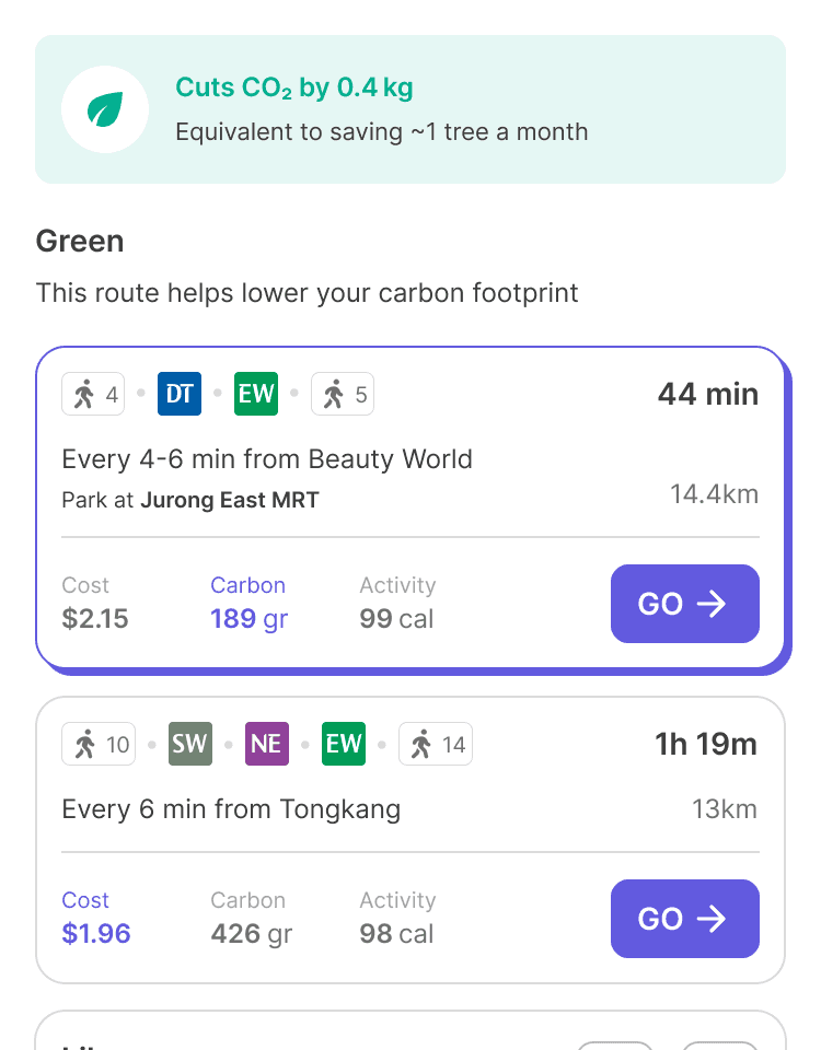
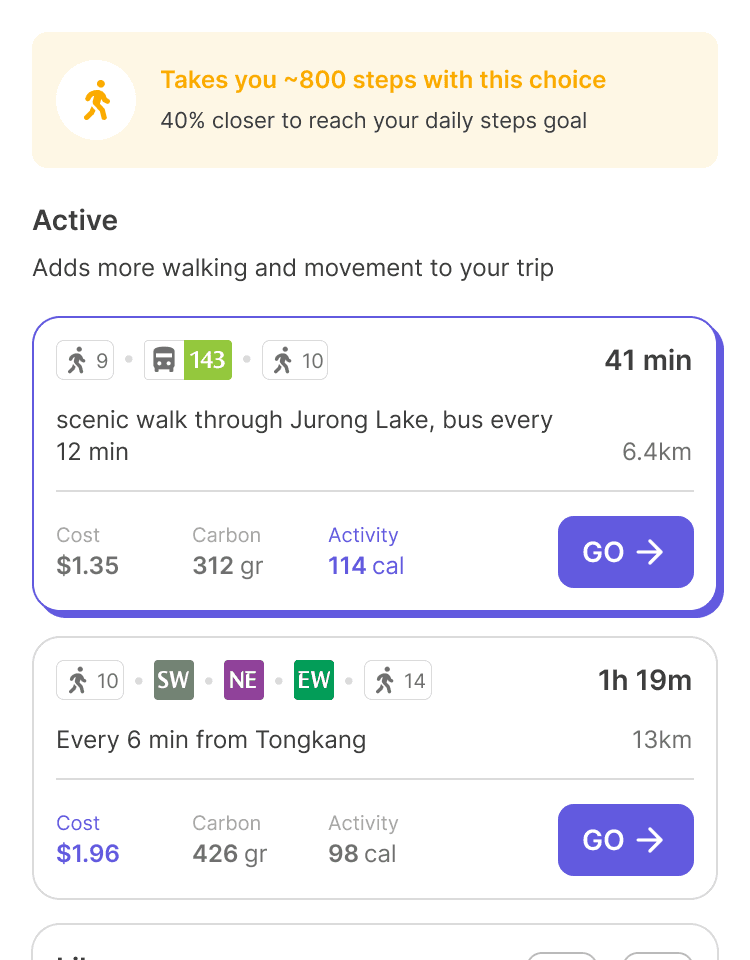
[↑] OZONE's preferences tab – Interact with one of the tab to see different results
The tab accommodates different types of commuter
Weekend Recommendation: Explore with a Guided Walk
To nudge users further toward car-lite lifestyles, OZONE introduces Weekend Recommendations, designed to encourage exploration without private vehicles. These appear directly on the homepage during weekends, promoting activities like walking.
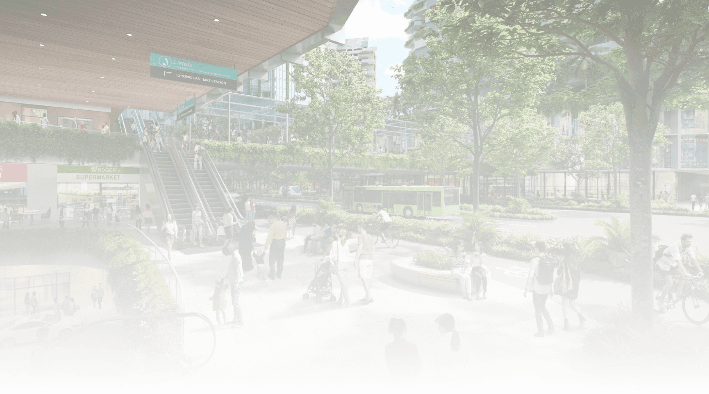
As a proof of concept, I integrated the Jurong Heritage Trail, one of Singapore’s official walking trails. I mocked up its route, checkpoints, and points of interest into a seamless, self-guided walking experience within the app. Users can follow the trail from point to point, with contextual information and visual cues that make the walk feel purposeful and informative.
This feature reframes the app not just as a commuter tool but as a weekend companion.

[↑] OZONE's Weekend Recommendations
Nudge users to walk through Singapore's official trails
Stage 3; Post-Decision
Stepping up to stage 2 is where users can actively decide between options. Initially, we explored two approaches — Direction 1, focused on proactive suggestions and Direction 2, which emphasized comparative insights.
But the clients wants both and realized both approaches could complement each other. By creating a well structured and clear information architecture, we combined the benefits of both into a single screen.
Users get timely suggestions and can compare options in one flow, creating a smoother, more confident decision-making experience that builds trust and supports diverse commuting goals.